Showing posts with label Research and Planning. Show all posts

Saturday, 4 January 2014

Double Page Spread Draft

Double Page Spread Draft
I need to edit the text and write the article as well as edit the pictures to fit the genre more and to make the material appropriate for my target audience. I have done this to some extent through the use of my models as they are members of my target audience too so are therefore appropriately linked.

________________________________________________________________________
Eleanor Wemyss


Saturday, 28 December 2013

Contents Draft

Contents Draft
I need to change the image for a variation in my work and change the fonts as variety is needed in real media products. The layout is conventional to real media products as it is based on NME's contents page. The page design is also conventional as it is the same size as media products as has a balanced array of image and text.

________________________________________________________________________
Eleanor Wemyss

Friday, 6 December 2013

Layout Research

Layouts Research
I have researched into the top three magazines my target audience chose; NME, Kerrang and Classic Rock. The layouts used by these magazines work well with appealing to audiences judging by their popularity with my own.

COVERS

I have looked at the covers of Kerrang but I find the layout is too complicated for my rock genre as they have too many colours, fonts and images, I would rather have a simpler cover.

I like the layout of this magazine as the image and title are the main factors rather than the cover lines. The title stands out and is easy to read and the pose of the models is fun, this is the style I want to create with my own magazine.

 
I find there to be too much negative space on these covers as the image takes up most of it but is not carried with text either, personally I would like more text.


CONTENTS
Again I do not like the layout as it is too complicated though I do like the large image at the top. The colours are too bright and over packed with the text harder to read. 


I like the use of image but the colour is too dull and there is too little text for what my audience wants. They  want to be properly informed on the content of the product they have bought, so I will not be using this layout.

I like the contents page for NME as the layout is easy to navigate and the main article is easy to find. The use of a large header saying "Inside this Week" works well as the audience learns it is a weekly magazine. I like the use of the few main colours and the amount of informative text versus amount of image.

DOUBLE PAGE SPREAD

I like the double page spread of Kerrang for the large amount of image and text. As it is an article it is expected to be packed with image and information. I like the large headers as they link to the colours of the rest of the page and the text is easy to find and read. The images are gritty and realistic and showcase all of the band members and at least one colour of their costume is seen in the title. Therefore I shall use this layout.

The layout is too simple and will not catch the eye of my audience as the colours are not bright and the headers are not punchy enough. The text is too small and long to keep the attention of my target audience and the amount of negative space is overwhelming.

Though I like the cinematography and mise-en-scene used I feel the rest of the colours is lacking. The main article should be bright and worth the money spent but the colours used in NME are lacklustre. There is not a lot of text in comparison to the images as the images take over more than half the page, I do not want this for my own.

Therefore for my inspiration I have chosen the following...

Inspiration

I got my inspiration for my product from these magazines as my questionnaire results proved these to be my target audiences favourites. This will help me decide on layout and style as well as appeal to my audience directly. My product will sell more and be a success as my target audience has identified the mode of address and house image they like. 

The cover of Classic Rock. The layout and colour is ideal.

The use of text of NME's contents page is the preferred layout of Rocket Ship.

The layout of the text and pictures is perfect for my product as it showcases the information and visuals.

___________________________________________________________________________
Eleanor Wemyss

Friday, 18 October 2013

Photography Shooting Script and Shot List

Photography Shooting Script and Shot List

Photo shoot date: Friday 22nd November, South Downs College drama department room. Used for the dark background and good lighting. Medium Shots, and Close-ups. 8:30am.


My images for front cover, contents and double page spread. 

The first photo shoot was on Friday 22nd November 2013 at 8:30am-9:00am. 106 photos were taken, of which 12 were considered for use. The models were J. Maxim and M. Cottrell of South Downs College, whom are both studying music. They were ideal models as they have the rock look and have inside knowledge to music. I have yet decided which image I would like to use.

Thursday 28th November 2013
After putting my images onto the desired size of my magazine, I realised they would not appropriate as they were mostly landscape and lost pixels when being expanded. This led me to do another shoot, but this time with a different background and different number of subjects. This led me to having 100 photos, with 34 considered for use, before narrowing it down to 4. The shoot was at 1:30pm-1:40pm on Thursday 28th November. I may use the previous images for my double page spread, but I shall be using the new images for the cover. The background is much more consistent and the subject is in better light. The use of the long shot makes him look more imposing and strong to match the genre of rock. The use of the acoustic guitar versus an electric one is symbolic to the preferred magazine title at this current time in production. It also symbolises the changing media mode as rock is not just the one genre any more, it has become a variety of sub-genres, but with the underlining aspect of power and presence to the individual musician. Therefore, these photos are much better than the previous through a combination of different setting, pose and camera medium. 

I put my chosen image of the grey background on my cover but I was not happy with it as it now had too many colours and was distracting from the text. Instead I went back to the first shoot and re looked at the photos and have finally decided on this photo:


I have chosen this photo as I can manipulate it for the colours. I will need to crop it and change the lighting slightly as it looks too bright against the background. The use of the guitar is significant as it links to my double page spread and shows the genre of the music. With this image I believe my magazine will be conventional to the genre.


After audience feedback I again changed the image as it would definitely appeal to my audience as they told me specifically what they want. They said for a more studio based photo, so a black background and good lighting, and for the subject to actually look at the camera as they felt they were being ignored by the model. The use of eye contact makes the audience feel included in the piece. Therefore my new images look like this:


I will not selected one until I create my magazines cover lines and masthead as the image has to compliment them. For my other pieces I have already selected some pictures from earlier shoots, though the image for the contents page comes from a concert I went to as the crowds in the image were on such a large scale.

Shooting Script for Final Pieces
The shooting script shows the times, location, props and costume of each of my final photos to be used in my magazine. There are over 4 of my own images throughout my work of different people and settings to show my variation in cinematography. This also makes my product more conventional to the standard a magazine should be.
___________________________________________________________________________
Eleanor Wemyss.
Special thanks to: J. Maxim and M. Cottrell for being fantastic models and for putting up with my constant change of location and position.
M. Miles for helping me to turn on and set up the camera.
E. Aldworth and A. Cooper for letting me borrow their cameras, and for E. Aldworth for uploading the photos to my laptop.

Thursday, 17 October 2013

Photography Magazine Ideas

Photography Magazine Ideas
These are some magazine covers that link to the rock genre and have a good pose. The red coloured side is for covers that would not work as they are either not linked to the rock genre or the pose is too formal. The blue side is of poses that adhere to the genre clearly and give the reader an insight to the lives of rock stars.

I tried the poses of some of the blue side with my model, but found they are not completely flattering to my magazine image or that of the subject. Instead I conducted research into the poses that would flatter my subject and the brand image I want to create. 

The use of two shot medium/medium close-up shows the relationship between the musicians that are the subjects as well as their clothes and facial expressions. It uses the rule of thirds and can identify to the reader the genre of music and the content of the magazine.
So I may be using the same camera angle for my images, though I prefer the idea of a single subject with a long shot to get any instruments and fashion statements on the full page.

___________________________________________________________________________
Images from Google.com

Wednesday, 16 October 2013

Proposal for Music Magazine

Proposal Form for Music Magazine
The target audience my magazine will be aimed at is teenagers/young adults between the ages of 14-22 who frequently listen to indie rock and like the ideals represented by the genre. It will appeal more likely to males as they on average read more music magazines and are more likely to want to buy it. The research I conducted showed Kerrang and NME were the highest read by my target audience so my own magazine will follow partly of their format.
The main image for my cover will be a medium long shot of a male with an instrument of some kind, most likely a guitar as guitarists are most easily recognised in a band. They will pose with the guitar but a fierce/strong look like they don't need to be there as rock artists as they only need their music. This will make the magazine adhere to the genre and grab the attention of the target audience. I will get this image by finding a suitable background, such as a dark/cool colour such as grey or black as this will make my image subject stand out and taking a picture of someone I know who has the right look of a indie rock image e.g. long hair, tweed, acoustic guitar etc. 
The genre of my magazine is indie rock as there is a gap in the market for a specifically tailored magazine and it is a well liked genre according to my research. The typical content of the magazine will be; interviews with the bands, news, reviews, gossip, new instrument technology and upcoming gigs/tours. I found these to be typical of rock magazines and also through my questionnaire research. The magazine will be 28cm height and 21cm width as it is typical to a standard sized magazine and is the right size to fit all my content.
The cover lines will be edgy to the genre and the main feature will be toward the band. Cover lines such as; "Hydrolic Empire-We don't wanna be sued", "Photo-shoot with an arsonist-Its the music, not the guns that I like", "Social Hand Grenade-London Riots", "In The Bushes-Their biggest year ever!" and others that fit to bands and general music content.
The titles I tried were; Honour, Steel, Smooth, Bucket, Iron Rock as short quick titles work best with magazines as they can be easily recognised and remembered. I did not choose those however as they do not give enough information toward the magazine. I chose the title "Rocket Ship" as the tagline "the music is out of this world!" linked well. It also has the word 'rock' so the audience knows the genre of music straight away if they did not get it from the cover. It also links to the song "Rocketship" by Daniel Johnston which has an eery underlay to it but is ultimately a good song. 
For a font I want something bold to stand out when people see it and they will automatically know what the magazine is as it would become the trademark font. Therefore, I have looked at several different fonts and chosen Rockwell Extra Bold as it is strong and continues on the theme of the genre. I want the masthead to be the top word with the second word underneath to make it stacked and to be more ascetically pleasing to read rather than just a long word across the top. I may use a tagline such as "The music is out of this world!" as it is colloquial and links to the title as rockets frequent space and with the exclamatory it gives the words a more powerful impact on audiences.
It will be published fortnightly as that creates enough revenue and profit to keep the magazine going and generates enough interest from buyers. It also keeps up to date with the latest news but without bothering readers with the same information. I will use the colours red and black as they stand out and compliment each other, they are also well recognised for the genre of rock and can amplify emotional response from the target audience.
The average price of music magazines is £3.00-£6.00 so I will make mine £3.99 as people will not see that as being too much but it is enough so they know the magazine will be packed. I will also offer an inside additional selling point like a free poster as the audience will see that as them getting more money.
________________________________________________________________________
Eleanor Wemyss

Tuesday, 15 October 2013

Initial Ideas

Initial Ideas Mindmap
Inital ideas for my magazine in the form of a mind map. I shall use the webs to work out what information of work I shall need to complete. The different labels are important as they are the different sections of a magazine designing process.


___________________________________________________________________________
Eleanor Wemyss

Monday, 14 October 2013

Photo Plan Research


________________________________________________________________________
Eleanor Wemyss

Sunday, 13 October 2013

Photography Information Research

Photography Research Information
Screen grab of research completed on an Apple Mac into the rule of thirds with examples. This style of photography has helped me as I can focus on the main part of the image and line up where I want the main focal points to be.

___________________________________________________________________________
Eleanor Wemyss
Images from google. 

Saturday, 12 October 2013

Annotated Example of a Music Magazine Research

Annotated Example of a Music Magazine Research

I have annotated a cover, contents and double page spread of NME magazine to see the conventions of a music magazine to use in my own work.

COVER


CONTENTS


DOUBLE PAGE SPREAD


________________________________________________________________________
Eleanor Wemyss


Representation of Fans and Musicians of Rock

Representation of Fans and Musicians of Rock

Research
The fans of rock music

Articles:


Images:
Typical fans of rock

Graph regarding information about different music genre fans. From fan article 5.


The musicians of rock music

Articles:

Images:

Singer, drummer and guitarist - their fashion, age, gender relating to their representation

Information from musician article 2

----------------------------------------------------------------------------------------------------------------

How are fans and musicians of the rock genre represented in modern life?
Fans of the rock genre are usually perceived as “rogue” and “dangerous” by the media through the use of news reports where gigs have gone riot or there has been gang violence. The attitude towards rockers links back to the rise of rock ‘n’ roll in the 1950s. In the 1950s rock was so revolutionary that people didn’t understand it so saw it as a way for the youth to rebel. In the 80s rock music was everywhere and still is today. The fans and musicians may have evolved but the music stays the same.

   Researchers have been showing for years that fans of rock are rebellious, boisterous and more likely to lead to violence and mayhem, but from a psychological viewpoint in recent years they are actually shown to be “quite gentle” (article 1) and tend to be “creative, but are often introverted and may suffer from low self-esteem”, the negative image they are presented as has derived from the fashions they wear and the content of the music as the bass can be quite harsh and elect a feeling of elation and sometimes anger.
Sub-genres of rock such as indie rock show a similar view as they typically “have low self-esteem, are creative, not hard working, and not gentle” though this contrasts against the different style of music compared to hard rock. (article 2) 
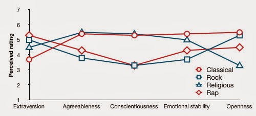
   Further research into rock fans from the opinions of 200 college students show that fans of the genre are less emotionally stable and agreeable that that of other genres but score high in their openness. (article 3) This is interesting to the representation of fans of the rock genre as they are still perceived as being out of control of their emotions but are open to new people and ideas, representing the freedom afforded to them through the music. 
   
   Of all the musicians of rock ‘The Beatles’ are probably one of the most celebrated as their music has touched the entire world and ‘the collective consciousness of several generations’ (article 6). They were seen as image makers and represented throughout the media as a class of music to be celebrated, the ‘four cheeky lads from Liverpool’ as they were effectively dubbed. They were so powerful they had “broken through second and third world censorship and regulations and set many millions free” just through the messages in their music. This is a positive representation of rock musicians in the media, though it has changed since the time of The Beatles.
   As seen in article 3 “Why do all rock stars die at age 27?” the article talks about how “sex, drugs – death – and rock” have all become factors in the negative representation of musicians of the genre. However the article then says “rock and roll is dead anyway”, which many fans would disagree with and the music sales show the real facts.
   Finally, the way a musician is presented links to their choice of instrument with drummers seen as “illiterate”, guitarists “posers”, bassists “ignorant and moody” and vocalists as “narcissistic and egocentric” (article 9) which is society's portrayal when in reality it is just a stereotype with little value in real information, though that is how it is perceived. This can be seen in covers of magazines such as this one;


Where the mise-en-scene reflects much about the model. Dave Grohl, lead vocalist of rock band ‘Foo Fighters’ is depicted here as angry with rumours and lies surrounding him. This is seen in his facial expression and also in the use of a red background. His costume is simple and links to the purple of the Marvel character ‘Hulk’ who is famous for his temper and shows to the audience the suffering he has had at the hands of the media. This shows that the stereotype of rock musicians being angry has some truth to it and is portrayed through their musical lyrics and sound. Though the stereotype is not true for a lot of them.

Overall fans and musicians of the rock genre have evolved in modern times seen in the media of articles and magazines representation. They are seen as unruly through the presentation of the media industry but from other points of view are actually calm and quiet people, thought heir music is their outlet for their worries and stress. The representation has changed from the beginning of the rock genre to now and will continue to change as the genre evolves into something new.
“Rock and roll keeps you in a constant state of juvenile delinquency.” (Eddie Spaghetti, 2000)

________________________________________________________________________
Eleanor Wemyss

Friday, 11 October 2013

Interview Vox Pop of Target Audience Research

Target Audience Interview Vox Pop

I identified members of my target audience and interviewed them into their opinion of music magazines and other parts of the music industry. This will help me create my product.

INTERVIEW 1: ELLIE ALDWORTH


INTERVIEW 2: RACHAEL SELWOOD


___________________________________________________________________________
Eleanor Wemyss

Vox Pop Audio with Target Audience

Vox Pop Audio with Target Audience 
I interviewed members of my target audience to find out their favourite song and genre of music, this was to further my research into the music styles my audience likes so that I can input the information into my music magazine. I can do this by adding information into their favourite songs and having a song index on the double page spread. This will appeal to my audience as it is information taken directly from them.

________________________________________________________________________
Eleanor Wemyss

Thursday, 10 October 2013

Target Audience for Rocket Ship Identified Research

Target Audience
The product I will create is aimed at young adults aged between 14 and 22 who have an interest in rock music and other sub genres such as indie rock or acoustic and like to be kept up to date with all the latest news and events. This will be reflected in my product as the content I include will link specifically to that of my audience and a generic music magazine as I do not want to go too far from what my audience expects.
   A typical member of my target audience can be categorised through age, gender, class, lifestyle choices and other identifiers. Their hobbies and personal image are also reflected through the type of media they consume. For example, a typical member of my audience would always have a pair of earphones of good quality and a good quality music player on their person as they are constantly listening to music in their day-to-day lives and know the latest updates in music tech through online blogs or magazines subscriptions. Their possible hobbies include; skateboarding, music practice, going to gigs, gaming and hanging with their friends. Their dislikes include; going shopping, pop music, make-up, team sports, going to the cinema and dating lots of people. This is due to their love for music and their talents rather than the superficial. My product appeals to them as it unites people of the same calibre.
   My product is aimed more towards the male part of my audience as the colours are darker and there are more male dominated ideals such as mainly male bands and male rock icons. The price is model for the class of my audience as it is affordable and packed with information so they are getting a good deal for their money. The class I identified is the working class as they are likely to have part time jobs and live with their parents, also linking to their age range.

   My target audience is more likely to take out a subscription on my product rather than buying it separately so that they do not miss out on any covers or up to date news. Through my questionnaire I asked my target audience what they would like to see in Rocket Ship and they said they would like to see album reviews, interviews, tour dates, pictures and new instrument technology, this was a key research technique as I can identify with my audience of the content that appeals directly to them.

Typical male and typical female to read and enjoy Rocket Ship

My target audience are most likely to be found frequenting coffee shops and the town centre or at the skate park than anywhere else as it gives them the freedom music affords to them. They can be who they want to be without conforming to society and showcase their talents and interests. They are typically happy and well rounded individuals and would buy my product as it has the things that appeals to them. After I make my product I shall ask my target audience for feedback and make sure I adhere to the content they prefer.

 ___________________________________________________________________________
Eleanor Wemyss
Photos from Google.co.uk