Showing posts with label Construction. Show all posts

Tuesday, 7 January 2014

FINAL PIECES CONSTRUCTION

FINAL PIECES CONSTRUCTION
My final pieces.

Cover:


Contents:


Double Page Spread:

________________________________________________________________________
Eleanor Wemyss


Double Page Spread Audience Feedback

Double Page Spread Audience Feedback

After creating my product I asked my target audience for feedback on where I could improve. This is my product so far:


This is what my audience has said:


1) "The pictures are all the same people and they are boring and don't really show that they are rock musicians"


2) "Well I don't think the main header looks that big, its not that important to the page, you should make it stand out more"


3) "Text is hard to read and the fonts are boring"


Changes


I have made the text larger and spread across more so that it is easier to read and gives the information to the audience better. It also makes it look more like an article rather than a collection of images and text.

I have added an inner shadow to the text to make it stand out more, per what my audience identified as needing improvements. This has given it emphasis as it introduces the product and the articles content.

I began to change my images by taking some new ones (see photography shooting script) and editing their angle and colour. I found the images all had too much of an array of colours and needed to be more toward a house style, so I have edited them so that they are grey, apart from the main image as it needed to stand out more, so I added a faded sepia tone to it as it would give it more colour but not largely to be distracting. 
(Editing using Adobe Photoshop)

The images are now transformed to be grey scale, but unified in their colour scheme. This also links to the colours of red, black and white throughout my product, keeping to the house style. They also now show the models to have instruments, creating a link to the rock genre due to the information I found in the audience feedback, that they wanted better images as the previous were 'boring'.
To edit the photos I used Ribbet.com and Photoshop.
The use of resizing images function on Photoshop. It was helping as it made sure that my image fit the space I had planned for it to occupy. Though after retaking the photos I had to unsettle the following of my flat plans, though the product does still look the same.
Crop on Photoshop. This got rid of the chairs in the bottom right corner and the background behind my model. This was useful as it created focus just on the model. The function is standard use when editing most photos as many have negative space to be deleted.

I have also edited the page number as the conventional magazine double page spreads always have them in the bottom corner with the page and the magazine title. It also creates a link between my cover and contents as the cover advertised the interview and the contents directed the audience to the page.


Final Product
This is my final product as my audience has also had their opinion counted as the main use of my product is to appeal to them, which is what I have now achieved.

Old and New
________________________________________________________________________
Eleanor Wemyss


Monday, 6 January 2014

Double Page Spread

Double Page
This is my double page spread with an interview with my new band Hydrolic Empire.


Text:
When first entering a recording studio one might ask “What the heck do all these buttons mean?!” which was exactly what our interviewer said when meeting HE on their turf. Thankfully the lads were there to help explain with many grins shared at the stories of their antics in the strange room. JD Maxim, front man of the group and lead guitarist, told us “Yeah my first time in here was crazy. I was like ‘whoa what do these even mean’ when confronted with the microphone settings. But it’s all pretty straight forward when you get the hang of it. Now whenever we go to a studio we get straight into the music.”
   After settling into the resident chairs and with glass of water at hand the real questioning began.
How did you meet as a group?
Matt Cottrell (Bass): We kinda just met at college, wandering round with guitars and long hair.
Lance Dickinson (Drums): I joined late when they needed a drummer who knew what he was doing.
Charr Streete (Guitar & Bass): We’re still looking for one.
Who makes the ideas for the songs?
JD: We sorta all pitch in. I mean, we throw out ideas and build around that though the score usually comes from Lance and lyrics from Matt and myself—
Charr: I’m just the eye candy.
   The lads fall into a comfortable banter with each other saying their main roles and such.
JD: Well as front man I have to the most work with PR. Our manager handles a lot but we do the music exclusively.
Matt: Bass is challenging if your not prepared for the day. You have to actually concentrate sometimes.
Charr: I was going to make a sarcastic comment but no, bass is actually surprisingly hard. Though I play guitar as well, so I’m basically amazing.
JD: Or so he thinks.
Lance: As drummer I’m just in the background - keeping it all together. Without me HIGH 4 FEVER would not have been in existence.
What do you mean?
Lance: Well we wanted a completely new approach to our sound but at the time I was ill with mono at the time—
Matt: Ha ha I remember that! We couldn’t record without him—
Charr: —yes we could.
Matt: —So we had to wait for him to get over it. But when he did he came back the best we’ve ever seen him, making the band work even better than before.
Lance: I thought ‘Hey mono comes from kissing’ so why not combine that with the illness? And voila! HIGH 4 FEVER was born!
   Time was running out for this reporter, so with one last question the boys made their final say.
Who are your favourite bands?
JD: ‘The Bugs’. Definitely. I just love their lyrics.
Lance: Yeah ‘The Bugs’ also. Their drummer is someone to aspire to.
Charr: Bringo Starre? Yeah he’s cool. My favourite band is ‘AD/CB’ though, because their rock really speaks to me and they have been a band for like ever, so I kinda want us to aspire to be like them.
Lance: That’s the most emotional you’ve ever been! Its touching really.
Charr: DON’T get used to it man.
Matt: Ha! We won’t. Mine would be the ‘Flying Cougars’, who are playing in April at the O2. I know the bassist.
Thank you for your time and I hope you have a blossoming career!
JD: Thank you!
Matt: Yeah thanks.
Lance: It was nice to meet you! See you around!
Charr: Yeah, hopefully they don’t annoy me in the coming years!
JD, Matt, Lance: HEY!

For the videoed interview go to: www.rocket-ship.co.uk

Main body

Exclusive Bar

Images

Layout finished, text to be written

________________________________________________________________________
Eleanor Wemyss


Sunday, 5 January 2014

Double Page Flat Plan

Double Page Flat Plan

Flat plan for my double page. 


________________________________________________________________________
Eleanor Wemyss

Saturday, 4 January 2014

Double Page Spread Draft

Double Page Spread Draft
I need to edit the text and write the article as well as edit the pictures to fit the genre more and to make the material appropriate for my target audience. I have done this to some extent through the use of my models as they are members of my target audience too so are therefore appropriately linked.

________________________________________________________________________
Eleanor Wemyss


Tuesday, 31 December 2013

Contents Audience Feedback

Contents Audience Feedback
After creating my product I asked my target audience for feedback on where I could improve. This is my product so far:


This is what my audience has said:


1) "Picture is a little blurry, too much white space around heading, proof read"


2) "Caption the image, gig guide is a bit hard on the eyes, 'ahve' check spellings"


3) "Change the font (headline) to make it stand out more"

Changes

From the feedback from audience member 2 I have changed the shade of blue of the gig guide to make it easier to read and more manageable on the eyes.

My audience members said that there was too much white space and to change the font, I have made these changes and this is the product. The font is now the same as my masthead, as are the stars, making the house style of my product more evident. 

My audience said the image was blurry so I have changed the contrast and balance of colour using Photoshop and used other various editing techniques such as filter.

The last thing that was suggested for change was the paragraph as there were several spelling mistakes as well as the audience found the subject to be confusing as it did not link to the picture. I have fixed this by changing the content to fit better to the main image rather than having ever piece of my product surrounding Hydrolic Empire.

Final Product
This is my final product as my audience has also had their opinion counted as the main use of my product is to appeal to them, which is what I have now achieved.

Old and New

________________________________________________________________________
Eleanor Wemyss

Monday, 30 December 2013

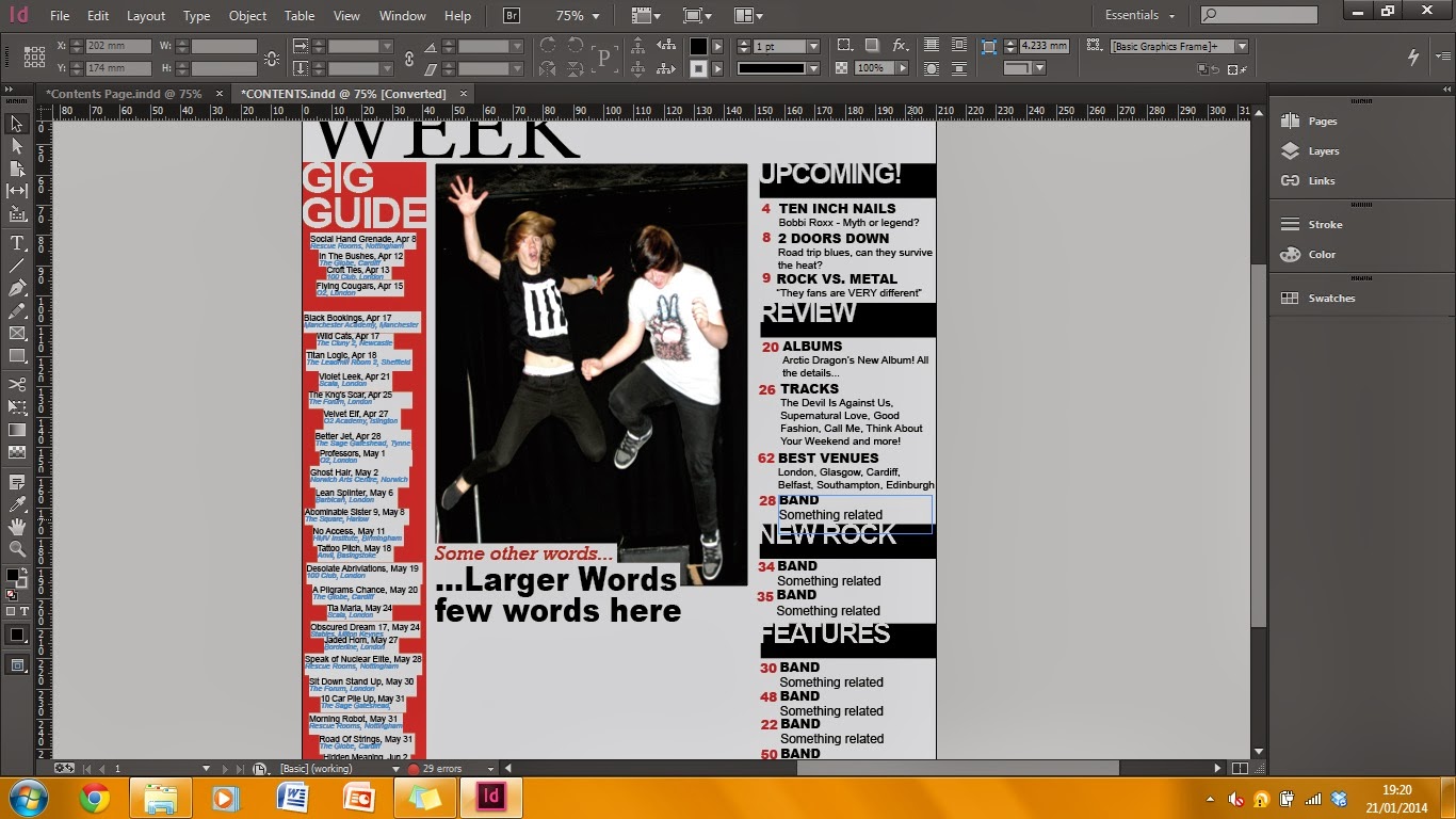
Contents

Finished contents
This is my completed contents page for my magazine.
Finished contents

Competition

Gig Guide done

Need a different photo

Changing colour

 I changed the photo to make a different style of photography as the new photo was taken at a gig I went to.
 ________________________________________________________________________
Eleanor Wemyss

Sunday, 29 December 2013

Contents Page Flat Plan

Contents Flat Plan

Flat plan for the contents page.


________________________________________________________________________
Eleanor Wemyss

Saturday, 28 December 2013

Contents Draft

Contents Draft
I need to change the image for a variation in my work and change the fonts as variety is needed in real media products. The layout is conventional to real media products as it is based on NME's contents page. The page design is also conventional as it is the same size as media products as has a balanced array of image and text.

________________________________________________________________________
Eleanor Wemyss

Cover Audience Feedback

Cover Audience Feedback

After creating my product I asked my target audience for feedback on where I could improve. This is my product so far:


This is what my audience has said:


1) "Image is too simple, main text [Hydrolic Empire] is hard to read "


2) "'PLUS!' doesn't stand out, neither does the red circle"


3) "Not enough information, contents lines are boring to look at, Rocket Ship title is unrealistic"


Changes

I have changed the masthead by adding a drop shadow to make it stand out and seem more realistic as a magazine as it is eye catching rather than the plain white before. I also added the shadow to 'Shock New Album' to make it look like an added sticker and more realistic as a product.


One member of my target audience said the main text of "Hydrolic Empire" was hard to read as the font made the words too close together. I made changes using a different font and the emboss tool on InDesign to make it really stand out. Now the shadows used on it accentuate the words and make them eye catching for the reader. I also added a black outline to the text so it is easier to read than my previous.

My audience also said there was not enough information and the cover lines were "boring to look at", so I have varied the fonts and sizes as well as colours to allow differentiation within my piece. I have also added another and made the others larger and longer to lessen the negative space.

I made the 'King' cover line stand out as it is a well known band (e.g. play on words of the popular band "Queen") and I have added a background to 'Plus!' to make it stand out and easier to read against the new image I have used. I changed the image to feature two members of the created band "Hydrolic Empire" as it makes them seem more popular as artists.

I have also made additional changes to my cover lines as I wanted them to stand out even more and to fit to the conventions of a music magazine.

I changed the image to look more studio based and for eye contact to my audience as they feel more included in the product. It also makes it more realistic to the genre as the costume of my model links better due to the dark colours and Led Zepplin t-shirt, a well known rock band.
I chose to put the image over the masthead as it is used a lot in most magazines, to do this I had to use Adobe Photoshop CS6, and I deleted the background and drew around the hair so that there were no dark spaces to to obstruct more of the masthead. 


Final Product
This is my final product as my audience has also had their opinion counted as the main use of my product is to appeal to them, which is what I have now achieved.

Old and New
________________________________________________________________________
Eleanor Wemyss