Showing posts with label Blogger. Show all posts

Monday, 6 January 2014

Double Page Spread

Double Page
This is my double page spread with an interview with my new band Hydrolic Empire.


Text:
When first entering a recording studio one might ask “What the heck do all these buttons mean?!” which was exactly what our interviewer said when meeting HE on their turf. Thankfully the lads were there to help explain with many grins shared at the stories of their antics in the strange room. JD Maxim, front man of the group and lead guitarist, told us “Yeah my first time in here was crazy. I was like ‘whoa what do these even mean’ when confronted with the microphone settings. But it’s all pretty straight forward when you get the hang of it. Now whenever we go to a studio we get straight into the music.”
   After settling into the resident chairs and with glass of water at hand the real questioning began.
How did you meet as a group?
Matt Cottrell (Bass): We kinda just met at college, wandering round with guitars and long hair.
Lance Dickinson (Drums): I joined late when they needed a drummer who knew what he was doing.
Charr Streete (Guitar & Bass): We’re still looking for one.
Who makes the ideas for the songs?
JD: We sorta all pitch in. I mean, we throw out ideas and build around that though the score usually comes from Lance and lyrics from Matt and myself—
Charr: I’m just the eye candy.
   The lads fall into a comfortable banter with each other saying their main roles and such.
JD: Well as front man I have to the most work with PR. Our manager handles a lot but we do the music exclusively.
Matt: Bass is challenging if your not prepared for the day. You have to actually concentrate sometimes.
Charr: I was going to make a sarcastic comment but no, bass is actually surprisingly hard. Though I play guitar as well, so I’m basically amazing.
JD: Or so he thinks.
Lance: As drummer I’m just in the background - keeping it all together. Without me HIGH 4 FEVER would not have been in existence.
What do you mean?
Lance: Well we wanted a completely new approach to our sound but at the time I was ill with mono at the time—
Matt: Ha ha I remember that! We couldn’t record without him—
Charr: —yes we could.
Matt: —So we had to wait for him to get over it. But when he did he came back the best we’ve ever seen him, making the band work even better than before.
Lance: I thought ‘Hey mono comes from kissing’ so why not combine that with the illness? And voila! HIGH 4 FEVER was born!
   Time was running out for this reporter, so with one last question the boys made their final say.
Who are your favourite bands?
JD: ‘The Bugs’. Definitely. I just love their lyrics.
Lance: Yeah ‘The Bugs’ also. Their drummer is someone to aspire to.
Charr: Bringo Starre? Yeah he’s cool. My favourite band is ‘AD/CB’ though, because their rock really speaks to me and they have been a band for like ever, so I kinda want us to aspire to be like them.
Lance: That’s the most emotional you’ve ever been! Its touching really.
Charr: DON’T get used to it man.
Matt: Ha! We won’t. Mine would be the ‘Flying Cougars’, who are playing in April at the O2. I know the bassist.
Thank you for your time and I hope you have a blossoming career!
JD: Thank you!
Matt: Yeah thanks.
Lance: It was nice to meet you! See you around!
Charr: Yeah, hopefully they don’t annoy me in the coming years!
JD, Matt, Lance: HEY!

For the videoed interview go to: www.rocket-ship.co.uk

Main body

Exclusive Bar

Images

Layout finished, text to be written

________________________________________________________________________
Eleanor Wemyss


Monday, 30 December 2013

Contents

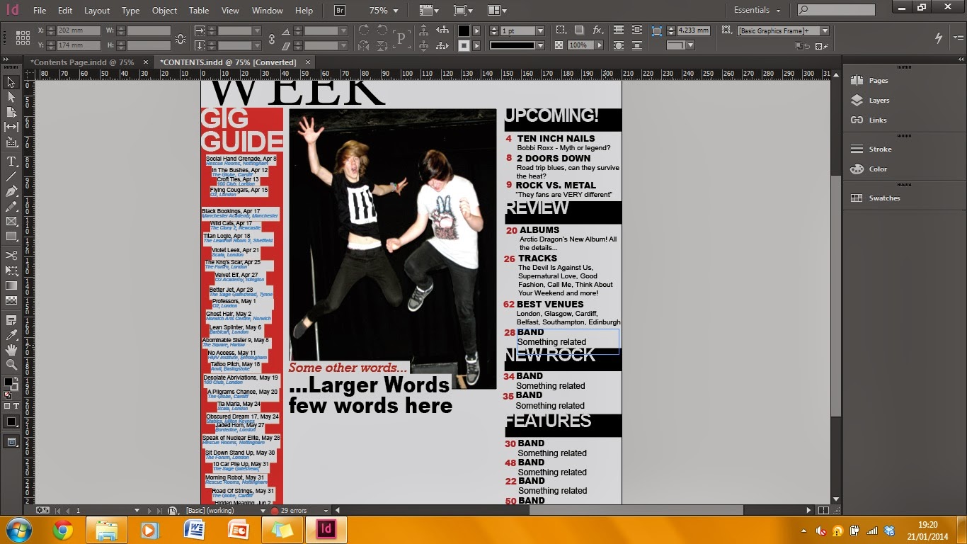
Finished contents
This is my completed contents page for my magazine.
Finished contents

Competition

Gig Guide done

Need a different photo

Changing colour

 I changed the photo to make a different style of photography as the new photo was taken at a gig I went to.
 ________________________________________________________________________
Eleanor Wemyss

Friday, 27 December 2013

Cover

Finished Cover

This is my final cover.

Adding the masthead text using the font Rockwell
Finished masthead 
Adding cover lines
Finish product

This is the production stages my front cover went through before being my final product.
________________________________________________________________________
Eleanor Wemyss

Friday, 6 December 2013

Layout Research

Layouts Research
I have researched into the top three magazines my target audience chose; NME, Kerrang and Classic Rock. The layouts used by these magazines work well with appealing to audiences judging by their popularity with my own.

COVERS

I have looked at the covers of Kerrang but I find the layout is too complicated for my rock genre as they have too many colours, fonts and images, I would rather have a simpler cover.

I like the layout of this magazine as the image and title are the main factors rather than the cover lines. The title stands out and is easy to read and the pose of the models is fun, this is the style I want to create with my own magazine.

 
I find there to be too much negative space on these covers as the image takes up most of it but is not carried with text either, personally I would like more text.


CONTENTS
Again I do not like the layout as it is too complicated though I do like the large image at the top. The colours are too bright and over packed with the text harder to read. 


I like the use of image but the colour is too dull and there is too little text for what my audience wants. They  want to be properly informed on the content of the product they have bought, so I will not be using this layout.

I like the contents page for NME as the layout is easy to navigate and the main article is easy to find. The use of a large header saying "Inside this Week" works well as the audience learns it is a weekly magazine. I like the use of the few main colours and the amount of informative text versus amount of image.

DOUBLE PAGE SPREAD

I like the double page spread of Kerrang for the large amount of image and text. As it is an article it is expected to be packed with image and information. I like the large headers as they link to the colours of the rest of the page and the text is easy to find and read. The images are gritty and realistic and showcase all of the band members and at least one colour of their costume is seen in the title. Therefore I shall use this layout.

The layout is too simple and will not catch the eye of my audience as the colours are not bright and the headers are not punchy enough. The text is too small and long to keep the attention of my target audience and the amount of negative space is overwhelming.

Though I like the cinematography and mise-en-scene used I feel the rest of the colours is lacking. The main article should be bright and worth the money spent but the colours used in NME are lacklustre. There is not a lot of text in comparison to the images as the images take over more than half the page, I do not want this for my own.

Therefore for my inspiration I have chosen the following...

Inspiration

I got my inspiration for my product from these magazines as my questionnaire results proved these to be my target audiences favourites. This will help me decide on layout and style as well as appeal to my audience directly. My product will sell more and be a success as my target audience has identified the mode of address and house image they like. 

The cover of Classic Rock. The layout and colour is ideal.

The use of text of NME's contents page is the preferred layout of Rocket Ship.

The layout of the text and pictures is perfect for my product as it showcases the information and visuals.

___________________________________________________________________________
Eleanor Wemyss

Tuesday, 15 October 2013

Initial Ideas

Initial Ideas Mindmap
Inital ideas for my magazine in the form of a mind map. I shall use the webs to work out what information of work I shall need to complete. The different labels are important as they are the different sections of a magazine designing process.


___________________________________________________________________________
Eleanor Wemyss
Friday, 4 October 2013

Preliminary Task - Contents Flat Plan

Preliminary Task - Contents Page Flat Plan
Flat plan of a contents page for ANON magazine.

________________________________________________________________________
Colours link to my cover

Saturday, 28 September 2013

Task 4 - Essay


To what extent should magazines be held responsible for the social ramifications of the representations they offer?

The covers that are seen from all displays stands of magazines have changed over the decades. No longer are they very wordy or cartoon style but they feature a single main image of a person and cover lines detailing the stories inside. The cover usually represents the target audience, the content and is used to capture the attention of the readers. It also shows the conventions of the genre as the colours and appealing aspects all have reasons as to why they are used. For example; Bliss, a monthly British magazine aimed at teenage girls, uses bright colours, a well known celebrity and appealing stories, attributing to the genre of a girls magazine. As do several others such as Girl Talk, Seventeen, Sugar and Mizz magazines, all aimed at a teenage audience. They all, to an extent, force the idea of representation on the youth of today and as they are seen as trustworthy, people start to believe what they say.

Other than the covers, the content of a girl’s magazine leaves a lot to be desired by the older generation. No longer are they quizzes, trivia, boy bands and television programmes, they have evolved to being attributed to ages of 20+ rather than the target audience that actually read it, such as 12-16. The magazines have moved the nation on making young girls less innocent and now outlandish, which has been seen in a negative light.
   In Mizz magazine, the topics of boys and beauty outweigh the childlike issues such as sleepovers and friends. This can have a damaging impact on young impressionable girls as they will believe that the only things to life are looks and getting a man. This is wrong to teach youngsters as they will not see strong female role models anymore, they will see the weak flirty feminine image that was present in the 1950’s, and it needs to be brought back that women can be strong and independent. The cover of the August 2009 issue features the main image of a female celebrity along with the cover lines of “7 stages of break-up”, “15 ways to make him end it” and “beat those blushes”, which would appeal to girls of the age 16+ rather than the target audience of pre-teens (ages 11-14) that it is aimed at. This is causing girls to grow up much quicker, affecting all social aspects of teenage years.

In the magazine Girl Talk, the reader age is aimed at young girls of 7-12. They have a responsibility to protect their audience from being exposed to sexual imagery and content above their ages. The magazine represents girls as pretty and young. The September 2010 issue (featuring Demi Lovato) uses a medium shot for her clothes and her face. This shows her expression and the openness the magazine is trying to convey. The other images feature young girls or animals, appealing to the young ages. It represents them as having fun and enjoying life before all the teenage issues they will encounter. It attributes well to the genre codes as it is light and happy and doesn’t feature articles on boys, but on best friends and the weekend. The representation is positive and appealing to adults as they will not be worried about the content their child is subjected to, as it is trustworthy and safe. The uses of pink, aqua and yellow creates a soft, childlike feel to the cover creating a sense that the content will not feature articles on rape or such other forceful subjects that are not appropriate at such a young age.

Sugar magazine is aimed at the older teenage years and early adulthood, for ages 16-24. It is a British magazine that focuses on boys, fashion, celebrities and other similar stories, ideal for the target audience. The social aspects it entails models the correct outlook on life people should have. As it is for the elder readers, it does not have as strong guidelines so the content does not have to be as censored as others should be. This gives it creative freedom and the representation within does not affect the readers as they are old enough to understand. It represents girls as strong, pretty, smart and casual all in one, ideal for a role model, making the female stereotype into a good thing. Though it features articles on boy issues, it gives advice to those of dating age, rather than something to aspire to that the other magazines have been demonstrating on young audiences.

The magazine Seventeen however, has changed its representation and genre as the media world moved on. It first began as a publication towards inspiring teen girls to become inspiring role models in work and citizenship, but soon changed into a more fashion and romanticised periodical as the audience moved on.  Though attempting to maintain the model of self confidence in women, the covers usually show the genre as being more made up and sexualised as the women featured are in provocative clothes and posing in provoking positions, less appealing to girls and more to men.

Teenage boy magazines are few and far between, as they appeal to both genders due to them featuring games, sports and films. Such as; Sports Illustrated, Entertainment Weekly and Game Pro, all of which are aimed at boys. Though none of them hold the same representation of sexualised men as we see with women. They do not have images of men posing provocatively, or how to deal with girls. The covers usually feature a male celebrity or character and inside knowledge on the chosen subject. In some cases, they have featured women scantily clad and sexual, but in a more vigorous outset than the teenage girl magazines. This shows that women are the ones being exploited throughout most magazines, making our view on representation affect our view on women socially, which has been caused by the media and magazines.


Overall, magazines are held responsible for how people are represented through their use of cover image and content of cover lines. They inspire generations to be people, whether in a good representation of human behaviour, or bad. Teenage girl magazines in particular should be monitored on their content and representation as they are used as learning material for young girls on how to act and deal with their issues. The content should be supervised and many same cover lines should be varied. The flirty representation of women should be removed to show them as strong and independent, and more articles on inspiring women should be featured, such as; Judith Butler, Eileen Collins, Louise Arbour, to give girls women to look up to and aspire to. Then the magazines will be seen as helping the younger generations more, rather than destroying their innocence and creating abysmal people.


Friday, 27 September 2013

Task 4: Essay Research

Five Magazines Aimed at Teenage Girls
  1. Bliss
  2. Girl Talk
  3. Seventeen
  4. Sugar
  5. Mizz

Bliss-(http://www.mybliss.co.uk/lovestuff/love)

Bliss is a monthly British magazine aimed at teenage girls, retailing at £2.75 and often comes with a gift such as make-up or a bag. The content covers candid celebrity gossip, latest fashions, hair and make-up looks, a problem page on puberty, boyfriends, friends and sex, interview with the female celebrity cover girl, entertainment reviews, romance advicepsychology for friendships and real-life stories.


Girl Talk-(http://www.girltalkmagazine.com)

Girl Talk is a magazine in Britain. The BBC publishes the magazine, which is nationally distributed. The target audience is girls from the ages of 7 to 12. It features a free gift and retails at £2.75.


Seventeen-(http://www.seventeen.com)
Seventeen is an American magazine for teenagers. It was the first teen magazine established in the United States.The magazine's reader base is 12–19 year-old females.It began as a publication geared towards inspiring teen girls to become role models in work and citizenship.Soon after its debut, Seventeen took a more fashion and romance-oriented approach in presenting their material, while still maintaining their model of promoting self-confidence in young women. It was first published in September 1944 by Walter Annenberg's Triangle Publications. Free gift. £3.99


Sugar-(http://www.seventeen.com)
Sugar was a British magazine for teenage girls published by Hachette Filipacchi. Its content focused on boys, fashion,celebrities, real-life stories about teenagers and other similar matters. The editor, when it closed, was Annabel Brog.The brand lives on through the website Sugarscape. Aimed at females 16-24, it is currently edited by Kate Lucey. First made in October 1994. Free gift. £2.00


Mizz-(http://www.mizz.com/obj/index.php)
Mizz Magazine is a magazine published in the United Kingdom, and is aimed at teenage and pre-teen girls (usually to those between the ages of 11 and 14). Mizz incorporates pages of fashion; displaying clothing trends, using models ranging from 12 to 16 years old. It encourages its readers to write in about events in their life, varying from serious to comic issues. It also contains information about celebrities in a 'gossip' form. The magazine also includes information on how to deal with teenage issues related to puberty, hygiene, friends and relationships. It has a range of competitions and quizzes and posters. It comes out once a fortnight and often comes with freebies (gifts). £2.62


___________________________________________________________________________


___________________________________________________________________________

References: ALL magazine covers from Google Images; ALL magazine synopsis from Wikipedia.

To look further read:
http://voices.yahoo.com/popular-teen-magazines-their-possible-effect-on-35176.html
&
http://www.telegraph.co.uk/culture/culturenews/4990907/Teen-magazines-are-sexualising-readers-says-watchdog.html

Thursday, 26 September 2013

Task 3: Magazines & Audiences - Cover Analysis


Task 3: Part 2 - Magazine Analysis

Billboard Magazine Analysis

Billboard is a worldwide news magazine dedicated to the music industry and music. It was founded on 1st November 1894 in Cincinnati by William Donaldson and James Hennegan as a trade magazine, but after the invention of the Jukebox in the 1930’s it began publishing music charts. The main charts are the Billboard Hot 100 (for the top 100 songs based on sales, internet streaming and radio play) and the Billboard 200 for album sales.

Target Audience

The target audience of Billboard magazine is evident through the main image, as it usually features popular music artists such as Taylor Swift and One Direction, appealing to the younger generations of today, most likely between the ages of 16-25. As the covers differ weekly on musicians, the magazine appeals to both female and male audiences. The most recent cover (10th October 2013) being Katy Perry, who has released a new album and is hot news to the target audience as they will be following what she does and listening to her album. This particular cover would appeal to females as Katy Perry is a role model, but would also appeal to males as they find her attractive. The age range would be 16-30 as she is 28 so her fandom is based around her age and those who listen to chart music. The audience would be from any class background and worldwide as she is well known. The magazine itself is also worldwide making the audience even larger. Katy Perry is also a fashion icon, so not just those who are into music, but those who like fashion as well would be likely to buy this magazine. As it is a popular magazine it can be bought from anywhere, and is a reasonable price, making sales high.

How does the cover appeal to audiences?

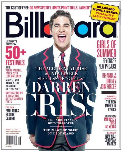
The April 23rd 2011 cover featuring Darren Criss as the main image appealing to audiences as he was a hot topic at the time and is still well known. The use of the medium shot on his clothes and shows his character as the blazer is iconic to the hit Fox show Glee. The use of the tag line “The accidental & inevitable success of Glee’s Darren Criss” tells those who do not watch Glee what the article is about, and informs those who know of Darren Criss through Starkid that he is now on Glee. The use of the large masthead makes the magazine easy to distinguish so fans will buy it. The pink and the black writing links to the colours of his blazer and the font is the same as the masthead making it a house style for the magazine. This makes it as the font is specifically for Billboard and no other.

What conventions of the cover design are evident?

The conventions of the cover design that are most evident is the main image as it is the first thing you see and part of the reason you would buy the magazine if you are a first time buyer, as it would be something that appealed to you. The next thing a potential buyer would look see is the masthead as it is bold, large, in a prime location and is a well known magazine. The use of a question above the masthead arouses curiosity as the viewer would want to find out more as it appeals to them, as Spotify is a well known app. The banner telling of the website, cost, barcode and date are key to the conventions of the magazine as they are needed on most products. The use of barcode on the front of the magazine makes it quicker for the vender to scan and so the consumer can read it faster. The picture bleeds into the bottom making it so the main image is the body and the face as it reveals much about the subject. The caption and the cover lines give information about the main feature and are used frequently on magazines as the largest and most seen text. The font links to the house style as it doesnt change throughout all Billboards covers and magazines. The negative space around the image and text makes it so the cover isn’t completely full and doesnt distract the reader. The use of the words “ultimate” and “new” cause the reader to want to gain the information. Finally, the use of the date as well as the month shows that the magazine is weekly and comes out around the same time each week.

___________________________________________________________________________
Image: Darren Criss - Billboard Magazine http://schumachermgmt.files.wordpress.com/2011/05/69350_1036760.jpg

Wednesday, 25 September 2013

Task 3(+): Magazines and Audiences - Glossary Annotations on Magazines

Task 3(+): Magazines and Audiences - 
Glossary Annotations on Magazines

Glamour Magazine-

Features: 18 Glossary Words
Colours: Pink, black, red, lilac, white
Genre: Fashion, dating, life
Target Audience: Women between 18-49
Founded: 1939 in United States
Launched: April 2001 in UK
Published: Monthly
Website: http://www.glamourmagazine.co.uk


Empire Magazine-

Features: 16 Glossary Words
Colours: Red, white gold, white, black
Genre: Film
Target Audience: Film fanatics
Founded: July 1989 UK
Published: Monthly


Take a Break-

Features: 15 Glossary Words
Colours: Pink, white, blue, yellow
Genre: True life stories
Target Audience: Women
Founded: 1990 UK
Published: Weekly


___________________________________________________________________________
ALL covers from Google, Annotations by me