Showing posts with label Preliminary Task. Show all posts

Monday, 7 October 2013

Preliminary Task - Contents Page Mock-Up

Preliminary Task - Contents Page Mock-Up
Contents page mock-up based on front cover and contents page flat plan. The colours are the house style of the magazine and its cover, the images connotate the target audience and the cover lines link to the format of a college magazine.

___________________________________________________________________________
Contents made by Eleanor Wemyss

Saturday, 5 October 2013

Preliminary Task - College Magazine Cover

Preliminary Task - College Magazine Cover
Produce a front page of a new college magazine, featuring a photograph of a student in medium close-up shot, plus appropriately laid out text and masthead.

Magazine Title: ANON
Cover lines: The Cheater's Tips-Don't get caught!, Manage Stress-Classes got you down?, Choose the enrichment that is right for you!
Feature: Hayley Newell-AS Good or bad?
Price: 93p
___________________________________________________________________________
Magazine made using InDesign
Photo taken using Samsung Galaxy S3
Barcode: Google
Special Thanks to: Hayley Newell-Cover Image, Kali Leonard-Title Inspiration, Jemma Green & Leah Baker-Price help

Friday, 4 October 2013

Preliminary Task - Contents Flat Plan

Preliminary Task - Contents Page Flat Plan
Flat plan of a contents page for ANON magazine.

________________________________________________________________________
Colours link to my cover

Thursday, 3 October 2013

Preliminary Task - Cover Design Flat Plan

Preliminary Task - Cover Design Flat Plan
Flat plan ideas for cover design.
________________________________________________________________________
Cover Design

Wednesday, 2 October 2013

Preliminary Task - Proposal

Preliminary Task  - Proposal for Cover & Contents

My target audience is for all college students, 1st-3rd years aged between 16-19 and any gender. It will feature different articles every week from all subjects to appeal to the largest audience. The typical content will be interviews, personal stories, features on aspects of the college and news about the college and events that have happened. My ideas for cover lines include; Coffee House, Principal Interview, Main Image subject interview, Cheater’s Tips, Managing Stress, and enrichments, as they are key to college life and would appeal to my audience. The magazine writing will be quite colloquial as students do not want to be stuck reading something boring or unimaginative as college days are long and they are not used to the large workload.
For the title of the magazine, I want to have a single word to sum-up college life as it is memorable for the audience and will be easily recognised. I brainstormed different titles and chose my favourite. I have chosen the title “Anon” as most students are anonymous at college until they become themselves and find their friends. It also links to Anonymous content I will feature in my magazine, such as opinion polls, as people may not want to be known. I did not use the titles “College Magazine”, “SDC”, "The Observer", “You” or “Student Mag” as they are generic titles and will not be interesting to potential consumers. Also with a shorter title the masthead can be bigger and bolder and more appealing to target audiences.
I want to use the same font throughout so I will choose one on the InDesign programme. I am looking for one like Ariel or Calibri as I do not want it to be fancy, or as boring as Times New Roman. I want the masthead to go across the page at an angle as it is more pleasing to the eye and is easier to work with. To go underneath the masthead, I want the tagline “The No. 1 College Magazine” as the audience believes it is the best and knows that it is definitely college based if they do not get that from the cover lines. It will go underneath the masthead as the consumer will read the title “Anon” as it is the biggest feature, and then continue reading down the page, therefore seeing the tag line.
The magazine will be weekly, on Wednesdays, but my particular cover will be seasonal for autumn, so autumn colours and trees and leaves will be a feature of the main image. The cover will reflect the seasons and the content of the magazine, such as a Halloween themed one with colours such as orange and black.
The image I want to use will be an image of a first year student as it will match the cover lines and it makes sense as it is the start of a new academic year. I will most likely use one of my friends as they are first years and can be found easily to be photographed. There are many trees around the college, but I want one with the building in the background. The image will be a medium shot to show the emotions, stance and clothes the subject is wearing, which will also represent the college student life and the connotations behind students fashion image. The clothes a person is wearing tells a lot about their character and will reflect the content and genre of the magazine. The use of a leafy place will show the changing of seasons into autumn which links to people’s minds as the start of work and learning as everyone has been through the same teaching.
The dimensions of the cover will be A4 as it is large enough to fit all the content it will include and can fit in people’s bags without folding. It also means it will be quite thin, so will not take hours to read and gives enough room for the text to be larger. The colours I will use will be bright and happy. I plan on red, yellow, blue, purple and green as they reflect moods and atmosphere and are also connotated to autumn. The use of blue and purple will be the feature of the masthead as they are neutral colours and can be used all year.
My magazine will be under £1.00 as students do not have much money, and as studies show consumers would rather pay 99p for something rather than £1. Psychologically, £0.99 looks cheaper than £1.00, so people are more likely to spend the 99 pence.

I also want to have a little negative space on the cover as it will make it look less busy. On the contents page, I will make the same links and colours as on the cover as it will link to the house style I want to be able to achieve. The fonts will all stay the same and the masthead will be featured on it as well. The contents will be a single page and have all the page reference numbers on it, as well as a note from the magazine editor as it gives the magazine a more human feel rather than computerized. 

___________________________________________________________________________
Magazine photography is the mural painting of modern times.” - Gene Thornton

Tuesday, 1 October 2013

Preliminary Task: Cover Photograph Evaluation

Preliminary Task: Cover Photograph Evaluation
I chose three first year AS students to be my models for my cover. 

The first being B. Knight who posed with an English Language book in the Courtyard Cafe. The picture was a medium close-up of torso and face to show emotion and costume. The colours featured mainly were yellow, blue and red linking to my initials ideas and the student is links to my cover lines ideas. I chose not to use this picture as the lighting was too bright and it does not show the time of year, there is also interference of another students head being in the background. The book is also not visible for its cover, so is irrelevant to the genre fo the magazine. The subjects finger is also holding the book, making it look like she only has four fingers and there is not enough space to successfully put a mast head. Therefore, this picture will not be selected.
The second student I used was D. Walton in the setting of my desired background I will be using definitely for my cover. The picture has the building in the background, a tree on the right hand side and leaves in the foreground showing the time of year. The colours as mostly green, shades of yellow and bland coloured clothing, mostly linking to my inital ideas. The use of the folder showing that they are intelligent students with a lot of work and learning ahead of them. Again, it will not be used as it is not a medium close-up and the subjects eyes are closed. The pose of the subject suggests no emotional link to the camera or the surroundings making it seem distant, which audiences will not like and therefore not buy the product. I took another picture of Walton to decide whether I would use him as a model.
This picture is better as it is a medium close-up and Walton's eyes are open. The background has the college and the yellow of the folder is bright. The space around the model is good as I have enough room for cover lines and plugs. It does not have the tree or the leaves, making the time of year harder to guess and therefore not linking to the date of publication. The smile from Walton is more of a grimace and the shadows on his face make it harder to tell him emotions. The lack of other colours makes the cover boring and unlikely to catch the eye of potential consumers. The mast head would be in the way of his features and therefore make the use of a model pointless. In conclusion, this picture and model will also not be used as it does not have the desired effect.
The final image of H. Newell was the most accurate for my initial ideas as there is enough space for the mast head, the ideal colours I wanted are all included in the image making them link well, the image is a medium close-up with the college in the background and the tree easy to see. The cover lines will fit and there will be enough space for a puff of an exclusive bar to advertise the main stories. The happy grin of Newell makes it welcoming and as if she has a secret for the audience, about college life. The hair to the side shows that Newell is leaning in a submissive and friendly way and easily approachable. The use of the scarf shows that the cold months as coming but can still be bright as the colours are vibrant and numerous. The main colours being yellow, red, green and blue linking to the college logo, autumn and a happy environment. Overall, it is the best of the images and will be used well for my cover and encompasses all my initial ideas fluidly. 


“The secret to modeling is not being perfect. What one needs is a face that people can identify in a second. You have to be given what’s needed by nature, and what’s needed is to bring something new.”  - Karl Lagerfeld
________________________________________________________________________
Special thanks to: B. Knight, D. Walton and H. Newell for being fantastic models.

Monday, 30 September 2013

Preliminary Task: Initial Ideas

Preliminary Task: Initial Ideas Mindmap
Mindmap of my initial ideas for a college magazine cover.


Dr. John Watson: [about Sherlock's "mind palace"
"It's a memory technique. It doesn't have to be an actual place. The way it works, you put information there, and theoretically you'll never forget it, you just have to find your way back to it."
___________________________________________________________________________
By Eleanor Wemyss


Sunday, 29 September 2013

Target Audience - Preliminary Task

Target Audience of Tween Magazines
The target audience for magazines such as Bliss, Seventeen and Girl Talk is young girls from ages 8-14 who are on the cusp of becoming a teenager. They are girls as they use colours such as pink, purple and white and mostly feature a young girl or teenage icon on the cover. They feature young persons activities such as quizzes, competitions, good faith stories, fashion and freebies linking specifically to girls such as make-up or jewellery. This is shown throughout the magazines as their stories feature the day to day life of young girls at school such as "crushes" and embarrassing stories and do not have hard hitting articles that would be more likely found in an adults magazine such as "Take A Break" and "Chat".
   Cover include female icons such as Taylor Swift and Demi Lovato, or male bands that appeal to young girls such as The Wanted and One Direction. This is because they pose no threat to the fragile innocence that young girls possess.

(Demi Lovato on Bliss cover - aimed at teenage girls)

Girl Talks target audience is aimed slightly lower of girls between the ages of 7-12 years old. This is seen on their front cover through the bright colours and girl models, appealing to them as they are still at the age where boys are not nice. The achieve their target market as they have based their image on what young girls like. 

(Girl Talk - £2.75)

Seventeen is based for 12-19 year old girls, so a slightly older TA that that of magazines before but they still achieve their audience as the content is more mature and issues are higher priced to fit the content. 

(Article about body image in magazines)

The content is different to appeal to them better as these are issues they would like to be raised. Therefore they achieve their target audience through their content, layout and image differentiation. 

(Typical Target Audience member of a girls magazine)

(Typical Target Audience member of a teenage girls magazine)

___________________________________________________________________________
Eleanor Wemyss

Task 5: IPC Case Study

Task 5: IPC Case Study
Case study in to the company IPC Media. IPC Media produces over 85 iconic media brands, with their print brands alone reaching almost two thirds of UK women and 44% of UK men - almost 27 million UK adults - while their online brands collectively reach 20 million users every month.

What types of magazine and target audiences has IPC been associated with over the years?
Since the 1800's IPC has been associated with a vast number of magazines, ranging from all genres. The first being 'The Field' in 1853 which consisted of countryside issues such as fishing, farming and hunting, aimed at men. IPC then went onto publications such as 'Country Life', 'Horse and Hound', 'Yachting World' and others in the late 1800's, all being centered around the same target audience. But in 1911 the first woman's magazine 'Woman's Weekly' was published, changing the target audience to not just men, but women as well. From the 1920's to the 1940's women's magazines became more frequent. Magazines such as; 'Woman's Own', 'Woman', 'Ideal Home' and 'Woman And Home' became popular. With 'NME' magazine beginning and publishing music charts, IPC had to change again the whole target audience it appealed to. In the 1990's 'Now' and other real life magazines were featured and created a new audience, leaving IPC with now three main target audiences; mass-market women, up-market women and men. However, with 'Nuts' being launched in the 2000's, then age and demographic of the men they appealed to, had to evolve. The target age generalised for IPC is the mature audiences above age 16 as the hobbies and interests featured are not suitable nor appealing to younger people. 

Target Audiences:
Men= Leisure and lifestyle magazines
Mass-Market Women= Woman's weekly and TV magazines
Up-Market Women= Luxury fashion magazines, lifestlye and home interest.

Why might IPC be an appropriate publisher for a new music magazine?
'NME' is one of the world's most known music magazines and a title of IPC. It is well known and makes a huge profit with its sales every year. IPC Media  attributed to its success as its publisher, helping with sales as IPC is such a large magazine company. This shows that is it a strong publisher for a new music magazine, but would probably be better suited for a news woman's magazine as that si its main target audience. IPC is more likely to publish a magazine of rock music, like NME, than other genre's, but it would open up a larger audience base which IPC might be interested in. 
What sorts of genres of music/types of magazines might they be likely to publish?
As they publish 'NME' magazine which is centered around rock music, IPC is more likely to publish those of the same genre as it is known to bring in a lot of revenue and audience's, as well as audience pleasure. As it is a niche market, a rock or indie music magazine will most likely be their choice of product or pop music as they have a strong and loyal fan base and IPC must be making money. As NME has been successful, they may be open to new music magazines to get the same reaction. 

Why might alternative publishers like Bauer be appropriate?
Bauer has over 80 influential and well known brands and radio stations such as; Heat, GRAZIA, Closer, Match, Magic 105.4, Kiss 100, Kerrang and 4Music. Its business is "built on millions of personal relationships with engaged audiences" making it an ideal publisher for any music magazine that wants to appeal to a large audience. It features the best selling music magazine 'Q', 'Mojo' and 'Empire' highlighting how strong of a publisher it is as practically everyone can name one of their magazines. Wenner Media Inc. would also be a good publisher as they have published the music magazine 'Rolling Stone' which has 11 million viewers each week. Though Wenner Media would be unlikely to publish other music magazines due to its success with Rolling Stone. It has only two other publications. The publication 'Rhinegold Publishing' would be unlikely to publish a rock magazine, rather a piano or jazz, so appeals to new magazines of classical music/musicians. 
___________________________________________________________________________
By Eleanor Wemyss

Muse Cover: http://www.nme.com/images/gallery/NMEMuseFestCover210311.jpg
Bauer Logo: http://www.thedrum.com/uploads/news/old/23110/master.bauer_media.jpg
Q Cover: http://images.q4music.com/content/q/theqdaily/80x80/q317_cover_web.jpg
Bono Cover: http://www.theworldsbestever.com/2007/11/07/rollingStone-bono-cover.jpg
Rhinegold: http://www.londoninternationalpianosymposium.co.uk/wp-content/uploads/2011/08/rhinegold-publishing-logo.jpg
Wenner Media: http://www.mediabistro.com/fishbowlny/files/2012/12/Wenner_logo_MD.gif

Saturday, 28 September 2013

Task 4 - Essay


To what extent should magazines be held responsible for the social ramifications of the representations they offer?

The covers that are seen from all displays stands of magazines have changed over the decades. No longer are they very wordy or cartoon style but they feature a single main image of a person and cover lines detailing the stories inside. The cover usually represents the target audience, the content and is used to capture the attention of the readers. It also shows the conventions of the genre as the colours and appealing aspects all have reasons as to why they are used. For example; Bliss, a monthly British magazine aimed at teenage girls, uses bright colours, a well known celebrity and appealing stories, attributing to the genre of a girls magazine. As do several others such as Girl Talk, Seventeen, Sugar and Mizz magazines, all aimed at a teenage audience. They all, to an extent, force the idea of representation on the youth of today and as they are seen as trustworthy, people start to believe what they say.

Other than the covers, the content of a girl’s magazine leaves a lot to be desired by the older generation. No longer are they quizzes, trivia, boy bands and television programmes, they have evolved to being attributed to ages of 20+ rather than the target audience that actually read it, such as 12-16. The magazines have moved the nation on making young girls less innocent and now outlandish, which has been seen in a negative light.
   In Mizz magazine, the topics of boys and beauty outweigh the childlike issues such as sleepovers and friends. This can have a damaging impact on young impressionable girls as they will believe that the only things to life are looks and getting a man. This is wrong to teach youngsters as they will not see strong female role models anymore, they will see the weak flirty feminine image that was present in the 1950’s, and it needs to be brought back that women can be strong and independent. The cover of the August 2009 issue features the main image of a female celebrity along with the cover lines of “7 stages of break-up”, “15 ways to make him end it” and “beat those blushes”, which would appeal to girls of the age 16+ rather than the target audience of pre-teens (ages 11-14) that it is aimed at. This is causing girls to grow up much quicker, affecting all social aspects of teenage years.

In the magazine Girl Talk, the reader age is aimed at young girls of 7-12. They have a responsibility to protect their audience from being exposed to sexual imagery and content above their ages. The magazine represents girls as pretty and young. The September 2010 issue (featuring Demi Lovato) uses a medium shot for her clothes and her face. This shows her expression and the openness the magazine is trying to convey. The other images feature young girls or animals, appealing to the young ages. It represents them as having fun and enjoying life before all the teenage issues they will encounter. It attributes well to the genre codes as it is light and happy and doesn’t feature articles on boys, but on best friends and the weekend. The representation is positive and appealing to adults as they will not be worried about the content their child is subjected to, as it is trustworthy and safe. The uses of pink, aqua and yellow creates a soft, childlike feel to the cover creating a sense that the content will not feature articles on rape or such other forceful subjects that are not appropriate at such a young age.

Sugar magazine is aimed at the older teenage years and early adulthood, for ages 16-24. It is a British magazine that focuses on boys, fashion, celebrities and other similar stories, ideal for the target audience. The social aspects it entails models the correct outlook on life people should have. As it is for the elder readers, it does not have as strong guidelines so the content does not have to be as censored as others should be. This gives it creative freedom and the representation within does not affect the readers as they are old enough to understand. It represents girls as strong, pretty, smart and casual all in one, ideal for a role model, making the female stereotype into a good thing. Though it features articles on boy issues, it gives advice to those of dating age, rather than something to aspire to that the other magazines have been demonstrating on young audiences.

The magazine Seventeen however, has changed its representation and genre as the media world moved on. It first began as a publication towards inspiring teen girls to become inspiring role models in work and citizenship, but soon changed into a more fashion and romanticised periodical as the audience moved on.  Though attempting to maintain the model of self confidence in women, the covers usually show the genre as being more made up and sexualised as the women featured are in provocative clothes and posing in provoking positions, less appealing to girls and more to men.

Teenage boy magazines are few and far between, as they appeal to both genders due to them featuring games, sports and films. Such as; Sports Illustrated, Entertainment Weekly and Game Pro, all of which are aimed at boys. Though none of them hold the same representation of sexualised men as we see with women. They do not have images of men posing provocatively, or how to deal with girls. The covers usually feature a male celebrity or character and inside knowledge on the chosen subject. In some cases, they have featured women scantily clad and sexual, but in a more vigorous outset than the teenage girl magazines. This shows that women are the ones being exploited throughout most magazines, making our view on representation affect our view on women socially, which has been caused by the media and magazines.


Overall, magazines are held responsible for how people are represented through their use of cover image and content of cover lines. They inspire generations to be people, whether in a good representation of human behaviour, or bad. Teenage girl magazines in particular should be monitored on their content and representation as they are used as learning material for young girls on how to act and deal with their issues. The content should be supervised and many same cover lines should be varied. The flirty representation of women should be removed to show them as strong and independent, and more articles on inspiring women should be featured, such as; Judith Butler, Eileen Collins, Louise Arbour, to give girls women to look up to and aspire to. Then the magazines will be seen as helping the younger generations more, rather than destroying their innocence and creating abysmal people.


Friday, 27 September 2013

Task 4: Essay Research

Five Magazines Aimed at Teenage Girls
  1. Bliss
  2. Girl Talk
  3. Seventeen
  4. Sugar
  5. Mizz

Bliss-(http://www.mybliss.co.uk/lovestuff/love)

Bliss is a monthly British magazine aimed at teenage girls, retailing at £2.75 and often comes with a gift such as make-up or a bag. The content covers candid celebrity gossip, latest fashions, hair and make-up looks, a problem page on puberty, boyfriends, friends and sex, interview with the female celebrity cover girl, entertainment reviews, romance advicepsychology for friendships and real-life stories.


Girl Talk-(http://www.girltalkmagazine.com)

Girl Talk is a magazine in Britain. The BBC publishes the magazine, which is nationally distributed. The target audience is girls from the ages of 7 to 12. It features a free gift and retails at £2.75.


Seventeen-(http://www.seventeen.com)
Seventeen is an American magazine for teenagers. It was the first teen magazine established in the United States.The magazine's reader base is 12–19 year-old females.It began as a publication geared towards inspiring teen girls to become role models in work and citizenship.Soon after its debut, Seventeen took a more fashion and romance-oriented approach in presenting their material, while still maintaining their model of promoting self-confidence in young women. It was first published in September 1944 by Walter Annenberg's Triangle Publications. Free gift. £3.99


Sugar-(http://www.seventeen.com)
Sugar was a British magazine for teenage girls published by Hachette Filipacchi. Its content focused on boys, fashion,celebrities, real-life stories about teenagers and other similar matters. The editor, when it closed, was Annabel Brog.The brand lives on through the website Sugarscape. Aimed at females 16-24, it is currently edited by Kate Lucey. First made in October 1994. Free gift. £2.00


Mizz-(http://www.mizz.com/obj/index.php)
Mizz Magazine is a magazine published in the United Kingdom, and is aimed at teenage and pre-teen girls (usually to those between the ages of 11 and 14). Mizz incorporates pages of fashion; displaying clothing trends, using models ranging from 12 to 16 years old. It encourages its readers to write in about events in their life, varying from serious to comic issues. It also contains information about celebrities in a 'gossip' form. The magazine also includes information on how to deal with teenage issues related to puberty, hygiene, friends and relationships. It has a range of competitions and quizzes and posters. It comes out once a fortnight and often comes with freebies (gifts). £2.62


___________________________________________________________________________


___________________________________________________________________________

References: ALL magazine covers from Google Images; ALL magazine synopsis from Wikipedia.

To look further read:
http://voices.yahoo.com/popular-teen-magazines-their-possible-effect-on-35176.html
&
http://www.telegraph.co.uk/culture/culturenews/4990907/Teen-magazines-are-sexualising-readers-says-watchdog.html

Thursday, 26 September 2013

Task 3: Magazines & Audiences - Cover Analysis


Task 3: Part 2 - Magazine Analysis

Billboard Magazine Analysis

Billboard is a worldwide news magazine dedicated to the music industry and music. It was founded on 1st November 1894 in Cincinnati by William Donaldson and James Hennegan as a trade magazine, but after the invention of the Jukebox in the 1930’s it began publishing music charts. The main charts are the Billboard Hot 100 (for the top 100 songs based on sales, internet streaming and radio play) and the Billboard 200 for album sales.

Target Audience

The target audience of Billboard magazine is evident through the main image, as it usually features popular music artists such as Taylor Swift and One Direction, appealing to the younger generations of today, most likely between the ages of 16-25. As the covers differ weekly on musicians, the magazine appeals to both female and male audiences. The most recent cover (10th October 2013) being Katy Perry, who has released a new album and is hot news to the target audience as they will be following what she does and listening to her album. This particular cover would appeal to females as Katy Perry is a role model, but would also appeal to males as they find her attractive. The age range would be 16-30 as she is 28 so her fandom is based around her age and those who listen to chart music. The audience would be from any class background and worldwide as she is well known. The magazine itself is also worldwide making the audience even larger. Katy Perry is also a fashion icon, so not just those who are into music, but those who like fashion as well would be likely to buy this magazine. As it is a popular magazine it can be bought from anywhere, and is a reasonable price, making sales high.

How does the cover appeal to audiences?

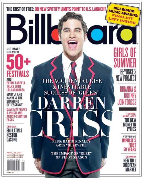
The April 23rd 2011 cover featuring Darren Criss as the main image appealing to audiences as he was a hot topic at the time and is still well known. The use of the medium shot on his clothes and shows his character as the blazer is iconic to the hit Fox show Glee. The use of the tag line “The accidental & inevitable success of Glee’s Darren Criss” tells those who do not watch Glee what the article is about, and informs those who know of Darren Criss through Starkid that he is now on Glee. The use of the large masthead makes the magazine easy to distinguish so fans will buy it. The pink and the black writing links to the colours of his blazer and the font is the same as the masthead making it a house style for the magazine. This makes it as the font is specifically for Billboard and no other.

What conventions of the cover design are evident?

The conventions of the cover design that are most evident is the main image as it is the first thing you see and part of the reason you would buy the magazine if you are a first time buyer, as it would be something that appealed to you. The next thing a potential buyer would look see is the masthead as it is bold, large, in a prime location and is a well known magazine. The use of a question above the masthead arouses curiosity as the viewer would want to find out more as it appeals to them, as Spotify is a well known app. The banner telling of the website, cost, barcode and date are key to the conventions of the magazine as they are needed on most products. The use of barcode on the front of the magazine makes it quicker for the vender to scan and so the consumer can read it faster. The picture bleeds into the bottom making it so the main image is the body and the face as it reveals much about the subject. The caption and the cover lines give information about the main feature and are used frequently on magazines as the largest and most seen text. The font links to the house style as it doesnt change throughout all Billboards covers and magazines. The negative space around the image and text makes it so the cover isn’t completely full and doesnt distract the reader. The use of the words “ultimate” and “new” cause the reader to want to gain the information. Finally, the use of the date as well as the month shows that the magazine is weekly and comes out around the same time each week.

___________________________________________________________________________
Image: Darren Criss - Billboard Magazine http://schumachermgmt.files.wordpress.com/2011/05/69350_1036760.jpg

Wednesday, 25 September 2013

Task 3(+): Magazines and Audiences - Glossary Annotations on Magazines

Task 3(+): Magazines and Audiences - 
Glossary Annotations on Magazines

Glamour Magazine-

Features: 18 Glossary Words
Colours: Pink, black, red, lilac, white
Genre: Fashion, dating, life
Target Audience: Women between 18-49
Founded: 1939 in United States
Launched: April 2001 in UK
Published: Monthly
Website: http://www.glamourmagazine.co.uk


Empire Magazine-

Features: 16 Glossary Words
Colours: Red, white gold, white, black
Genre: Film
Target Audience: Film fanatics
Founded: July 1989 UK
Published: Monthly


Take a Break-

Features: 15 Glossary Words
Colours: Pink, white, blue, yellow
Genre: True life stories
Target Audience: Women
Founded: 1990 UK
Published: Weekly


___________________________________________________________________________
ALL covers from Google, Annotations by me


Tuesday, 24 September 2013

Task 3: Magazines & Audiences - Glossary

Glossary of Magazine Design - 
26 Examples of Terminology

ANCHOR: Page reference on the contents page

AROUSING CURIOSITY: Asking questions or giving "how to" guides. Examples - "How to get Taylor Swifts hair style", "Lose weight through eating cake", "World's deadliest snakes"

AUDIENCE: The group of people the magazine is targeted at e.g. women, teenagers, athletes

BANNER: The title of a monthly magazine, which appears on the cover of the magazine and on the first page of the newsletter. It contains the name of the publication and serial information, date, volume, number

BARCODE: The black and white striped box, usually found in the corner

BLEED: Artwork that goes to the edge of the page

CAPTION: Text that relates/describes an image

CONNOTATION: An implication of a meaning e.g. snake=evil, danger

CONTENTS: List of subheadings and page references

CO-OPTION: Advertisers using news or media events for their own advertising  Like sun cancer scares, advertisers would make a new sun cream product to advertise and gain consumers

COVER LINES: Information about the main articles given on the front page of a magazine, usually a short sentence

DENOTATION: The literal meaning of a word e.g. snake=Reptile with scales and no legs, native to warm climates

FEATURE: Longer, more in-depth article

FONT: The look of text. Example: Text, Text, Text, Text

GENRE: Category a film, book, song or other is placed. E.g. Harry Potter Books=Fantasy 

HOUSE STYLE: The same colours, font, image type etc used so the audience can define the magazine style

MAIN IMAGE: Usually a person (most likely celebrity) large and in the centre of the cover. Attributes to the genre and form of the magazine

MASTHEAD: The main title of the magazine, at the top of the page - Usually bold and bright

NEGATIVE SPACE: The area of the page that doesn't have text, pictures or other elements

PLUG: Info on the contents of a magazine on the front cover

PUFF: Words or phrases on the cover of a magazine used to boost status

REPRESENTATION: How something is seen and shown to be

SPLASH: Main cover story

STEREOTYPE: Generalised view or judgement of people, assumptions the media have made, used to target the magazines audience

TAG LINE: Short phrase tagged to the masthead giving more information about the magazine

TIME OF CONSUMPTION: Monthly magazines for continued audience pleasure and loyalty


"The only place success comes before work is in the dictionary."
-Vince Lombardi 


Image: http://www.henrylim.org/Dictionary.jpg