Cover Audience Feedback
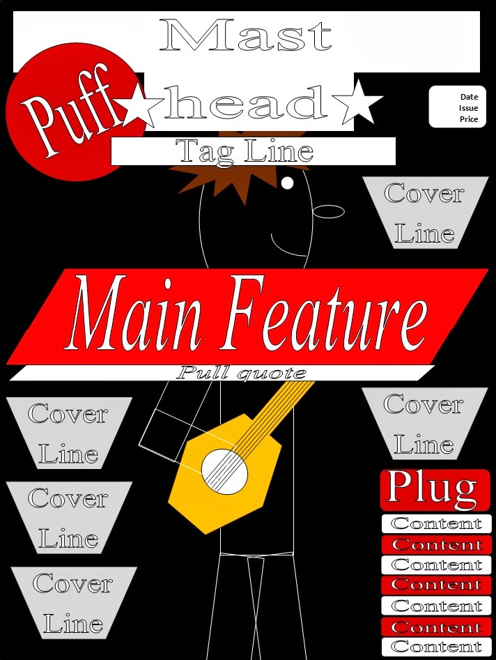
After creating my product I asked my target audience for feedback on where I could improve. This is my product so far:

This is what my audience has said:

1) "Image is too simple, main text [Hydrolic Empire] is hard to read "

2) "'PLUS!' doesn't stand out, neither does the red circle"

3) "Not enough information, contents lines are boring to look at, Rocket Ship title is unrealistic"
Changes

I have changed the masthead by adding a drop shadow to make it stand out and seem more realistic as a magazine as it is eye catching rather than the plain white before. I also added the shadow to 'Shock New Album' to make it look like an added sticker and more realistic as a product.


One member of my target audience said the main text of "Hydrolic Empire" was hard to read as the font made the words too close together. I made changes using a different font and the emboss tool on InDesign to make it really stand out. Now the shadows used on it accentuate the words and make them eye catching for the reader. I also added a black outline to the text so it is easier to read than my previous.

My audience also said there was not enough information and the cover lines were "boring to look at", so I have varied the fonts and sizes as well as colours to allow differentiation within my piece. I have also added another and made the others larger and longer to lessen the negative space.

I made the 'King' cover line stand out as it is a well known band (e.g. play on words of the popular band "Queen") and I have added a background to 'Plus!' to make it stand out and easier to read against the new image I have used. I changed the image to feature two members of the created band "Hydrolic Empire" as it makes them seem more popular as artists.

I have also made additional changes to my cover lines as I wanted them to stand out even more and to fit to the conventions of a music magazine.

I changed the image to look more studio based and for eye contact to my audience as they feel more included in the product. It also makes it more realistic to the genre as the costume of my model links better due to the dark colours and Led Zepplin t-shirt, a well known rock band.

I chose to put the image over the masthead as it is used a lot in most magazines, to do this I had to use Adobe Photoshop CS6, and I deleted the background and drew around the hair so that there were no dark spaces to to obstruct more of the masthead.
Final Product

This is my final product as my audience has also had their opinion counted as the main use of my product is to appeal to them, which is what I have now achieved.

Old and New
________________________________________________________________________
Eleanor Wemyss



.jpg)